How to Style Abstract Nature Prints in a Neutral Interior
There is a particular kind of wall that suits abstract photography well. Not a blank one — a considered one. A wall that has been given one thing to say and has been allowed to say it clearly. If you have ever stood in a kitchen or a dining room and felt that something was missing without being able to name it, there is a reasonable chance the answer was a single, well-chosen print.
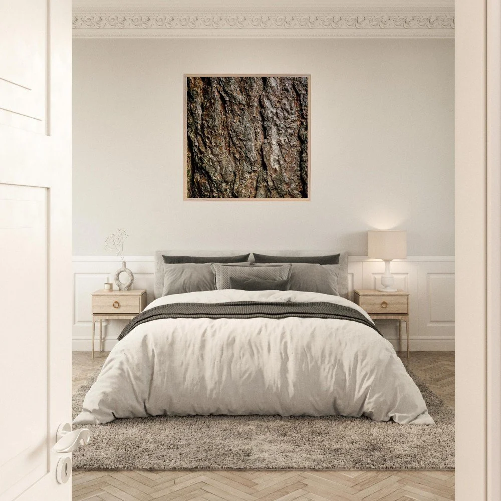
Abstract nature photography belongs in the rooms you actually live in. Not the formal sitting room that gets used three times a year. Not the hallway that everyone walks through without stopping. The kitchen, the dining room, the open-plan space where the day begins and ends — these are the rooms that reward a piece of art that repays looking. A print with genuine depth and detail gives you something new every time you glance at it. That is exactly what you want in a room you spend real time in.
Size matters more than most people think. The instinct when buying art for the home is often to go smaller than you should — to treat a print as an accent rather than a statement. With macro nature photography, that instinct works against you. The detail in this kind of image is the point. At 30×30cm you see a beautiful texture. At 70×70cm you see a world. If the wall can take it, go larger than feels comfortable. You can always step back. You cannot add detail that a smaller print has lost.
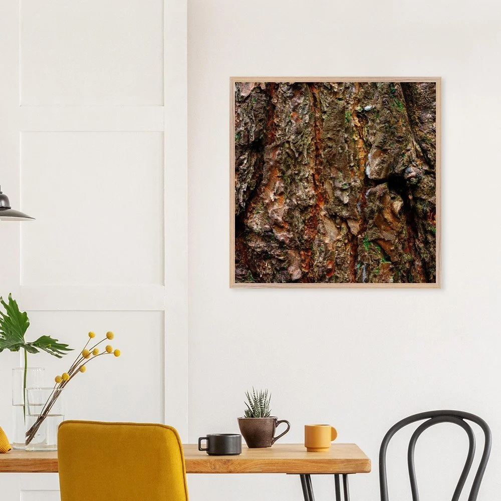
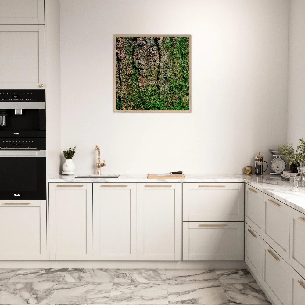
The best pairings are the simplest ones. Abstract photography carries a lot of visual information — colour, texture, pattern, depth — and it does that work best when the surfaces around it are quiet. An off-white wall is the most forgiving backdrop you can give a print like this, but do not discount a deep, flat colour either. A pure dark green or a terracotta wall will pull a warm-toned bark print forward in a way that a neutral never quite manages. What you want to avoid is competition — busy wallpaper, heavily decorated shelving, too many other pieces in the same eyeline.
Think about what sits near it, not just behind it. A smooth stone sculpture, a ceramic vessel with a simple silhouette, a piece of driftwood on a shelf — objects with clean edges and unhurried forms create a conversation with abstract photography rather than a argument. The contrast between the wildness of the texture in the print and the stillness of a simple object beside it is exactly the kind of quiet tension that makes a space feel considered. Interior designers know this instinctively. The rest of us learn it by getting it wrong a few times first.
In a kitchen, hang at eye height on a run of wall between units — the space above a worktop or beside a window is often underused and surprisingly well-lit. Natural light from a nearby window is flattering to photographic prints in a way that artificial light rarely is. In a dining room, a single large print on the wall you face when seated is one of the most effective things you can do with that space. You will look at it every day. Make it worth looking at.
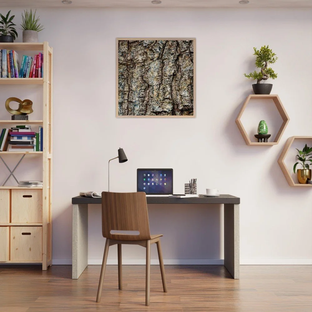
The store mockups I use to show prints in context are deliberately understated — plain walls, simple furniture, nothing competing for attention. That is not a styling shortcut. It is the point. The print is the thing. Everything around it is just permission for your eye to settle.
If you are unsure which print to start with, look for one whose palette already exists somewhere in the room. A kitchen with warm wood units and brass hardware will carry an amber-toned bark print effortlessly. A dining room in cool grey and white will find something unexpected and arresting in a print with deep blue-green undertones. You are not matching — you are responding. There is a difference, and it shows.